January 21, 2011

To do or what not to do; that's the question

Joan of Arc WWII - Commercial poster
This blog post is dedicated to 3 articles read during the last month including one very recent about Etsy.com. They all have one sad common theme: Major mistakes in marketing and social media efforts done by companies we wish...didn't, because a certain level of professionalism is expected. This implies  there ARE room for mistakes. Companies are made of humans and humans make mistakes. It is just that on this corporate level  an initiative from a PR department conducting a recap moment  is expected. And there is certainly a limit to how much you can blame it on bad planning and misunderstandings too.  As always  I want to point to the fact that it is always much easier to criticize than to walk the right path yourself. Regardless, these articles can be a learning lesson about what not to do. To sum up the underlying message it must be the following: What ever you are making, make it with purpose and not for money reasons only, cause sooner or later the lack of quality or your shallow intentions will be uncovered.

1. Stay true
2. Do not underestimate your audience 
3. If you do not believe in your product, nobody else will. 

Read about Gap's "Made in USA" holiday sales campaign to support their philanthropic "Feed the poor program" (Turned out one bag was made in China):   Gap Sends Conflicting Messages This Holiday Season

An interesting comment about Gap's blunder, authenticity and ethics: Be Authentic in Branding 

At last but not least, a blog post about the recent Etsy.com "situation" (read while thinking: Please don't tell me this is true!):  Congratulations. You've Tarnished Your Brand.

Everything moves in circles..

A humble reference to British artist Bridget Riley. Compared to the artwork on my "wall" could you say we use the same object to explore opposites like chaos versus order ? Born in 1931 she was part of a progressive op art movement in the 1960's, later becoming a worldwide famous artist with both artistic and commercial influence. She is now 80 years old and it's remarkable to think about how "avantgarde" her artwork was and still is; highly relevant in our digital age. Here's a video from "The Guardian" presenting her newest exhibition: 


To read an article about the artist: Bridget Riley at the National Gallery - review

Modern marketing - A conversation between equals

"Do I know you ?" - SeeBe's photoadventures
An article from Miami Herald discussing how principles of the AIDA model may be loosing ground in modern marketing:

Make your marketing strategy a ‘conversation between equals

Angry birds

Tsang Yiu Keung - For LEGO
New cool and artistic expressions from LEGO ! (Oh my did I love them as a kid. Sometimes "not found" due to hours of silent involvement with the colorful blocks.) It's good they are still around and able to compete with digital products, and as this shows an integrated  follow up on digital media and  games. LEGO gives a unique 3D understanding of objects. No wonder you can find the color blocks used in art and design schools.

See more of Tsang Yiu Keung's birds:

Angry Birds in LEGO

January 20, 2011

Signs of "Pixelism"

David Hockney
In my opinion digital art still has a long way to go in regards to be generally accepted, but the artform has actually been around since the 1970's. The inspiration for this blogpost was an article I stumbled upon recently about David Hockney who makes digital art. 

You may even oppose to use the word "digital" as a category for art, and some would even say how can you call it art when there's no traditional canvas or paper? It's like it doesnt exist! Well it does; but on a hardrive (and it can be created for the purpose of being printed too). 

But isn't it always like that. It's pretty human that it takes time to accept and get used to new trends and directions. Many thought Monet was "crazy", splitting up beautiful lanscapes into little dots, not to mention Picasso's impressions of a human face. I wonder what the painter's in medieval Italy would say about future artists; the fresco painters who had to produce their own colors and  paints using walls and ceilings as canvases. What would their opinion be about modern painters who could buy ready paint and canvases in a store? 

To read about David Hockney's digital artworks:

In Paris, A Display From Hockney's Pixelated Period 


Read about digital art in Wikipedia: Digital art

Soon you can have a 3-D Kodak moment.

An article about one of Kodak's newest products available on the consumer market spring 2011:

3-D comes to Photo Printers

Art jewel

A 17th-century paintings of the Lama Lhakhang
A wonderful art discovery in Bhutan, a tiny ancient country located in the Himalayan mountains between India and China. Here's an article about the art recently discovered:

Bhutan's endangered temple art treasures


The mermaid of Seattle

The first reactions has calmed down since Starbuck's released their new logo version. I am not going to make any in depth study about this change, except for expressing this as a change that makes sense from my point of view (in contrast to the Gap's logo change that I wrote about last year). I believe Starbucks have made some correct choices being a company operating on a global market where a strong universal visual impact  may be more  important than a written slogan or company name. With this overview of Starbuck's logo history it is also interesting to see  how the  mermaid  is moving "closer". From being a small decor element on their first logo to becoming the symbolic value of Starbuck's itself. Another aspect, the green color is unchanged which I believe points to their decision of the color being an important part of the recognition effect. By the way, do you know the mermaid of Seattle is deemed to be inappropriate for Saudi Arabia and is replaced with only the crown floating on the sea surface ? (basically it looks like she drowned). But that is a totally different discussion....

The transition artist

Yesterday was Cezanne's "birthday". Here's a chance to learn something new about the artist which ended up having an impact on art history. He may not be so famous as Monet and certainly not like Picasso. But what you might not know: he was  a  bridge builder creating the path from impressionism to cubism. Paving the way for... yes Picasso which were an early admirer of Cezanne's work. 
To read about Google's digital celebration of Cezanne and his life:

Paul Cézanne at 172: still life and landscapes run deep

January 15, 2011

A powerful trio

...with a cool aid kinda supervision from master Herbie Hancock:

Beautiful music

But this is my darling when it comes to music these days...

More sides than one...

Yes I have! I love this music too:

Logo recognition ;-)

"Aries have flashing eyes and charming smiles"...and "are ambitious and never quit.(according to @Sexstrology) Well, who knows in these times with astrology confusion. ;o)

January 14, 2011

Dancing in the street

A pop-up performance in Oakland, Calif.,


A new phenomena you will definitely see more of in 2011. Interestingly it can be also linked to a more commercial trend that you could read about in Trendspotting 2011 posted Dec.28th, where "planned spontaneity" is listed as one of the trends for the new year. It makes me think of this old music video, but Bowie and Jagger is not alone anymore!:


To read article about spontaneous gatherings: Art Attack! Random acts of culture

Article about taking the art to the street: Rupert Christiansen's culture diary: the perils of pop-up art

An uncomfortable discussion

On New Year's eve the new official logo for the summer Olympics 2016 was presented in Rio De Janeiro and it has initiated a discussion about plagiarism, copying and whether the logo is an original or if it has similarities to other logos and artwork.

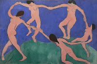
"La danse" (The dance) - Matisse
On January 5th I got the news on Twitter from Taxi and it was the first time I saw the logo. It  brought an immediate visual reference to Matisse' painting "La danse" and I had to  look it up just to confirm the similarity. Soon after, realizing I was not the only one pondering over the resemblance. OK I admit it, Matisse happens to be one of my favorite painters so in that context I am already subjectively driving out of objectivity. What I was not aware of was the similarity to Telluride's  Foundation logo. Before any further discussion I would like comment individually on each logo:

The Rio logo combines elegantly the Brazilian national (flag) colors utilizing 3 of the official colors of the Olympic rings. The context of the Olympic rings translated into (3) humans holding hands is  a visual translation of the Olympic spirit. The Telluride foundation logo is formed by 4 people in different colors holding hands in a heart shaped circle/movement which is a nice representation of a charity and philanthropy based organization caring for people.
      It really is difficult to say what has happened here and if you are looking for answers this blog post will not get you there but it might help to shed some perspectives. It is important to remember that designers, whether big or small never want to be accused for plagiarism because it hurts your reputation and your business. And it is one of those standards, at least it should be, that goes beyond the payment slip. 

      But what we also need to be aware of is the brilliance of our human mind. The fact is the human brain is able to store and recapture visual images from way back in time. A practical example: Your can remember a visual image from a billboard you saw in a glimpse several months ago while driving by it. You do not recollect the image itself as a clear memory but your subconsciousness can infiltrate this image into something you are creating visually. In other words: you are not aware you are "drawing under the influence". What I want to address is the striking resemblance of movements, angles and overall float between the logo and Matisse's painting. These are matters that are elusive to discuss and is best shown by example:

      January 2, 2011

      The power of colors

      Red with a symbolic value
      Here's an article touching the surface of a vast area: The use of colors in commercial design and marketing. This has been something of interest and study during my whole professional career and truly ignited after watching a documentary about the Shell logo and the work behind their change in 1995 for their new retail visual identity. It was fascinating to see the amount of work put into the effort to what they wanted to achieve. And it was not a big change, only a matter of different  hues of the yellow and red color. But for a worldwide company with enormous amounts of stations and stores it was an extensive process from the designer to the logistical challenges of changing the exterior and not to mention the price tag the color change had.  But it turned out to be worth it: The new hues worked as they should for Shell by being perceived as more fresh and consumer friendly. 

      The challenges for a small business owner is of course not the same but still it can be challenging enough to make a decision about use of colors whether it is a logo change or creating a design manual that integrates  your media needs (yes, even a small company should have one). There is a lot of information available, even tools to make your decision easier. But it can be well worth it to partner up with a designer, not only to save you time but to get a second opinion and talk to someone with relevant experience and advices. It is not a guarantee for color success but you could be a little closer to make a home run.

      Another interesting aspect about colors are their constant present on 3 different levels: They can have strong and sometimes very different cultural relevance, color taste fluctuate against trends and at last it is a highly personal matter of likes and dislikes.

      Read more about colors: "Why color matters"

      The color of 2011

      "Passion"
      I never intend to use the same illustration more than once on my blog but making an exeption this time by pulling out the digital illustration in regards to the posting: "Passionate people build passionate brands that attract passionate customers" 

      "Passion" was published December 5th, and on December 9th Pantone announced the color of the year 2011 "Honeysuckle".  As a designer it is nice to get this kind of confirmation about the work you do, especially when it comes to working with colors.

      Reading the article in The Wall Street Journal also confirms a reoccurring trend: In downturns people need optimism and favor/appreciate color strong nuances, while after a certain time of economical growth theres a tendency moving towards softer shades.

      To read the Wall Street Journal article: The New Hue for 2011

      Pantone's press release: Pantone Reveals Color of the Year for 2011