 On New Year's eve the new official logo for the summer Olympics 2016 was presented in Rio De Janeiro and it has initiated a discussion about plagiarism, copying and whether the logo is an original or if it has similarities to other logos and artwork.
  |
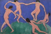
| "La danse" (The dance) - Matisse |
On January 5th I got the news on Twitter from Taxi and it was the first time I saw the logo. It brought an immediate visual reference to Matisse' painting "La danse" and I had to look it up just to confirm the similarity. Soon after, realizing I was not the only one pondering over the resemblance. OK I admit it, Matisse happens to be one of my favorite painters so in that context I am already subjectively driving out of objectivity. What I was not aware of was the similarity to Telluride's Foundation logo. Before any further discussion I would like comment individually on each logo:
The Rio logo combines elegantly the Brazilian national (flag) colors utilizing 3 of the official colors of the Olympic rings. The context of the Olympic rings translated into (3) humans holding hands is a visual translation of the Olympic spirit. The Telluride foundation logo is formed by 4 people in different colors holding hands in a heart shaped circle/movement which is a nice representation of a charity and philanthropy based organization caring for people.
The Rio logo combines elegantly the Brazilian national (flag) colors utilizing 3 of the official colors of the Olympic rings. The context of the Olympic rings translated into (3) humans holding hands is a visual translation of the Olympic spirit. The Telluride foundation logo is formed by 4 people in different colors holding hands in a heart shaped circle/movement which is a nice representation of a charity and philanthropy based organization caring for people.
It really is difficult to say what has happened here and if you are looking for answers this blog post will not get you there but it might help to shed some perspectives. It is important to remember that designers, whether big or small never want to be accused for plagiarism because it hurts your reputation and your business. And it is one of those standards, at least it should be, that goes beyond the payment slip.
But what we also need to be aware of is the brilliance of our human mind. The fact is the human brain is able to store and recapture visual images from way back in time. A practical example: Your can remember a visual image from a billboard you saw in a glimpse several months ago while driving by it. You do not recollect the image itself as a clear memory but your subconsciousness can infiltrate this image into something you are creating visually. In other words: you are not aware you are "drawing under the influence". What I want to address is the striking resemblance of movements, angles and overall float between the logo and Matisse's painting. These are matters that are elusive to discuss and is best shown by example:
 |
| Rio logo versus "La dan |
The Brazilian officials calls the similarity a coincidence and unintentional and I believe this is true. They point out that humans in circles are a universal and much used symbol which is also correct. What if the designers behind both the Telluride and Rio logo has been admiring or been aware of Matisse's painting from way back earlier in time? It is a famous painting and the chances you have been exposed to it is rather high if your background is related to art or design. These kind of visual incidents can happen to any designer and it really has nothing to do with quality or the talent of the designer or design agency. We are all under the influence of visual impressions at all times and sometimes inspiration sources surface during the first stages of a design project. This is also the time when a security net of research, project management and initialized discussions should be able to detect any similarities that can cause problems. I quote:
"Our logo went through the most rigorous system of checking intellectual property in the world. The International Olympic Committee for six weeks looked on each continent, checking to see if there was any sort of conflict between our logo and others that might exist," he said."
I just don't buy this statement or I would have to address it to the competencies of the committee that for 6 weeks have been looking for similarities without finding any.
Here is another quote from the articles:
"Graphic designer Dan Levy was quoted by Yahoo! News as explaining that “it’s common for the logos of small businesses to overlap, but that it’s inexcusable for a major international sporting event to come up with such an unoriginal design.”
To explore some viewpoints, check these articles:
Did The Rio Olympics Steal Their Logo Idea From Telluride?
Rio 2016 Olympics logo: a closer look
At last I also want to encourage to a look at this video from the design studio itself Tatil, which gives a glimpse into all the time and work that is put into the process of creating the logo. What I question is not the designers but the support system/organization around that should have been responsible for picking up issues like this on an earlier stage.
To visit Tatil: http://www.tatil.com.br/
To visit Tatil: http://www.tatil.com.br/

No comments:
Post a Comment